What is the original source of the chart?
And are you sure that is "world" market share? Seems... a little tough to believe.
I might take it slightly more seriously if your website URL wasn't your user name, and pasted into the image as well.
-
intric8

- Seattle, WA, USA

I'm also having a hard time to believe that this chart's accurate. this one here for example seems way more plausible:
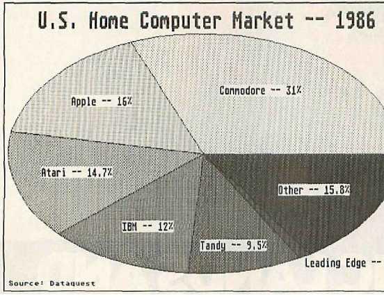
https://www.atarimagazines.com/compute/issue79/img7.JPG
or this one:
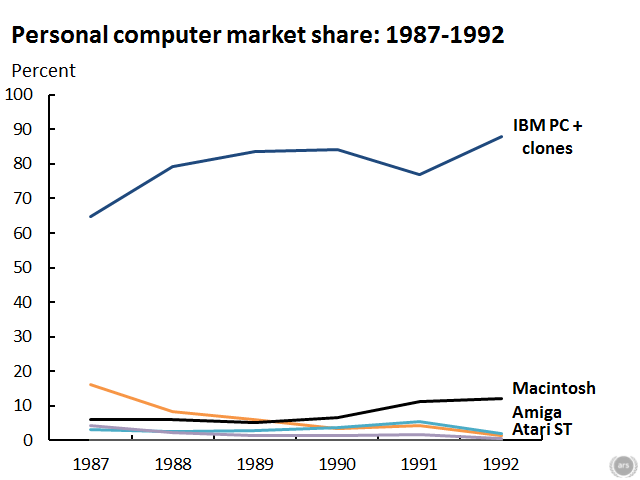
https://cdn.arstechnica.net/wp-content/ ... 7-1992.png
taken from
https://www.atarimagazines.com/compute/ ... vasion.php
taken from
https://arstechnica.com/information-tec ... t-share/2/
https://www.atarimagazines.com/compute/issue79/img7.JPG
or this one:
https://cdn.arstechnica.net/wp-content/ ... 7-1992.png
taken from
https://www.atarimagazines.com/compute/ ... vasion.php
taken from
https://arstechnica.com/information-tec ... t-share/2/
-
intric8
- Seattle, WA, USA
The Arstechnica image you've posted is the one I've always seen as the gold standard.
My guess is that screenshot from a video has some context missing from it. For example, it might have been from a specific country in a particular point in time, or potentially a geographical region. Or, it might have been even more narrow across a business industry, for example broadcast television.
Learning the origins of the chart, and video it came from, would solve everything.
-
intric8
- Seattle, WA, USA
It occurs to me now that this image very well may have simply been a mockup used in a software demonstration showing how the powerful Amiga was so much more than a games machine. A colorful graphical chart like this could be used in either a business presentation or broadcast TV environment.
I actually think - considering the year is 1987 - these numbers don't even make sense virtually anywhere in the world at the time. Back in 1987 I'm pretty sure the C64 was still selling more units than the Amiga - by a lot - due to the incredible differences in cost. In 1987 the Amiga had only just released 2 new models, and both were relatively expensive at the time.
This isn't 1992 in the UK with the release of the Batman pack and the A1200. This is 1987, with simply the A1000 (not a big seller anywhere overall), the A500 (best-selling Amiga of all time, and sold well in the US, but it was not a globally dominating machine) and the A2000 (likely sold more in the US and Germany than anywhere else in the world - but not at PC-levels and there's no way they dominated market share as shown in the graphic the 1st year they were released).
I'd be willing to bet that image was a demonstration of software with made-up numbers to create the chart to make the platform look good with a very bright future. In fact, I think I've convinced myself.